St Helier commercial architecture
Early 20th century town architecture
 Striking metal work on the Sun Works-OTC building at First Tower
|
Introduction
There is no lack of published material on the history of Jersey’s churches, fortifications and older rural houses, and these generally have an emphasis on historical events, on people’s day-to-day lives, and on family history.
Very little has been written, however, about the Island’s buildings after the mid-19th Century, even though this was a period of intense redevelopment which saw the introduction of new building types, new materials, and a plethora of unfamiliar architectural styles that were to alter the face of the Island’s capital, St Helier.
The scope of this paper is necessarily limited. Its aim is limited to stimulate a deeper interest in an aspect of Jersey’s cultural history that has so far been neglected - Jersey’s early 20th-century architecture and the forces that shaped it.
This paper, intended to form part of a series examining Jersey’s more recent architectural heritage, focuses mainly on non-residential buildings in the heart of St Helier, where many structures of considerable interest can be seen in a compact area.

A further paper will deal with houses and other residential buildings, where very different considerations are at work.
The study of architecture from earlier times is important not only because surviving buildings tell us much about the period in which they were created, but also because their physical presence can have a substantial, enduring and beneficial impact on their surroundings. It is during the period under review - the first four decades of the 20th Century - that buildings displaying great architectural diversity were implanted into the town. This contribution, possibly regarded as alien at the time, has greatly enriched the character of many of our streets. It is especially important when buildings to form pleasant ensembles, as can be seen in Royal Square, Broad Street, and in parts of King Street and Queen Street.
Such townscapes are powerful and evocative physical manifestations of town life over an extended period.
There are some fundamental requirements that affect the design of all buildings. First and foremost, they must satisfy the technical brief specified by the client, whether it be attractive and well-lit retail space, the efficient and well-ordered layout of rooms and facilities in a post office, or the ability to accommodate heavy loading in a warehouse.
Another primary requirement is that the development should be financially profitable, or, in the case of a public building, that it should be efficient and cost-effective.
Consideration of a building’s outward appearance only comes into focus when these primary matters have been resolved.
My approach in this paper is to consider the impact that certain buildings have on the public realm - the streets and spaces where we go about our day-to-day lives.
Buildings, after all, are intended to make a particular visual impact on their surroundings, thereby expressing the creative aspirations of designer and the imagined status of the client and his project. In consequence, buildings reflect the tastes of the time, leaving us with an enduring record of the decisions that were made.
19th century
The design of individual buildings in the early part of the 20th Century cannot be appreciated without a little understanding of the 19th-century architectural scene from which they emerged.
In St Helier in particular, some key themes were apparent by the closing decades of the century.
Most significant, perhaps, is that the appearance of buildings had become dominated by English taste and fashion, a trend which began in the late 18th Century with the influx of migrants.
The resulting cultural shift brought changing expectations about the quality and condition of the town, leading to development on an unprecedented scale.
New building types were needed, such as banks and retail stores, and new materials and methods of construction were emerging.
For architects and developers, the question of architectural style was then a significant matter, and for buildings of importance, a choice had to be made between two alternative architectural philosophies: the classical tradition, in its many guises, and the Gothic, which was less widely employed.
The ‘proper’ use of these alternative design philosophies was dictated by strict rules relating to proportion, architectural detail and materials.
A third important thread, permeating all buildings with architectural pretension, was the almost obsessive embellishment of interior and exterior surfaces, an influence that was only shaken off in the 1930s.

In the short walk from the Le Sueur Monument in Broad Street to the junction of King Street and Halkett Place, there are three excellent buildings that perfectly demonstrate these architectural preoccupations: the National Westminster Bank, 1873, designed in the Gothic style, the former Midland Bank in the classical idiom, and the former Assinder’s jewellers’ shop in Queen Street, 1882 (now Goldsmiths) which must be the most elaborately embellished building in the Island, utilising a remarkable range of materials and decorative devices.
Reference to the ‘battle of the styles’, often referred to in histories of 19th-century English architecture, is well represented in the surviving buildings of St Helier, but there is little evidence that this subject caught the public imagination here.
Though new architecture inspired by classical influences endures to this day, the influence of the Gothic tradition has long passed.
The reaction against these obsessions with style and over-decoration eventually led to new design movements that gathered momentum in the second half of the century culminating, in the British Isles, with the Arts and Crafts movement, and from there to Modernism.
The attachment to historic styles persisted, however, as can be seen in the architecture of the Edwardian period.

Jersey’s iconic building material - granite
Virtually all 19th-century buildings of status would have incorporated architectural features and details in the classical or Gothic idioms.
However, farm buildings, and other utilitarian structures such as warehouses and harbour works, generally ignored such affectations, and their uses and functions were often concealed behind simple and sparsely adorned exterior walls.
The local industrial vernacular tradition is inextricably linked to the use of Jersey’s native building material, granite.
The warm colouring of the pink Mont Mado stone, and glittering mica flakes that reflect the light, mean that even the plainest of buildings can be visually rewarding.
Although granite, sometimes in combination with local brick, was the default material for utilitarian structures, it also lends itself to use in buildings of very high status, in which circumstances it can be dressed and worked to produce architectural features of high quality (though not of intricate detail), as can be seen in the Market Hall in Halkett Place.
The adaptability of this material in the construction of the Island’s buildings gives it special significance.
From the early 20th Century there are two granite buildings that reflect new architectural influences; the first of these can be found outside the town centre at First Tower. It is the former Sun Works, built in 1901 by John Walker, and later renamed the Overseas Trading Corporation, or OTC.
At first glance the building appears to be a pair of commonplace granite warehouses, with gable ends on to the road, separated by a cartway
Extraordinary entrance and gates on the Sun Works-OTC building
But the entrance archway and metal gates are extraordinary. The OTC was a trading company specialising in tea blending and exportation of its products around the world, with an overseas base in Buenos Aires - a city known for its eccentric architecture.
When the firm outgrew its premises in Commercial Buildings its blending and packing facilities were relocated to its purpose-built new factory at First Tower. The architect has not yet been identified.
The gable walls are simple in design but exquisitely built in random granite rubble, carefully selected to present uniformity in the greyish colouring.
The flank walls, in contrast, show the usual range from brown to pink colouring, which is no less attractive.
The entrance arch is a decorative tour de force. The underpinning resembles a traditional Jersey arch of the sort leading into a farmstead, but the stones forming the arch are relatively small, and the mouldings which follow the curve of the arch are incised slots that simply run out where the curve ends.
The projecting granite hood over the arch seems to stop short of where it would like to be, and the corbels supporting it are simple rectangular blocks.
This wilful and imaginative reinterpretation of familiar local features is a sure sign of Edwardian taste, where informed imagination had free rein.
The parapet wall above the arch continues this theme in the eccentric shaping of the coping stones and the twin, diamond-shaped piercings.
These frame a centrepiece with a sun motif, contained to left and right by columns of triple bells, symbolising harmony.
In the metalwork over the gates the sun symbol is repeated, but here the two solid quadrants, which are attached to the gates, seem to anticipate the stylised forms of Art Deco decoration.
The projecting rays which extend outwards are made of metal bars and spikes. The gates themselves, also sheeted in metal, have two layers of applied panelling formed with reeded metal strips, with nail heads running in the space between them, while the head frame over the gates is dressed with an applied Greek key.
This is a startling and original composition, and one of Jersey’s most unusual buildings of the early 20th Century.

28 Halkett Place
In comparison with the OTC, the office building at 28 Halkett Place, built in 1912 for the Jersey Mutual Insurance Company, may appear rather sober.
This would not be a fair judgment of the high level of skill involved in the creation of this very competent and pleasing facade. The architects, Messervy and Quérée, were in partnership from 1909 and based their practice in this building from 1913 until 1924, after which Hedley Quérée continued here in his own name. If it were known at the inception of this project that the architects would establish themselves here, which seems likely, this would explain the unusually large windows on the upper floor levels; these must have created ideal conditions for a drawing studio.
Hedley Quérée, born in 1877, is known to have had a keen interest in the history of St Helier - in 1904 he prepared a map which aimed to show the extent of the town, and its key features, as it was thought to be in the year 1700.
Given this interest, he would presumably have been familiar with the Island’s architectural traditions.
The decision to build in granite is significant, because apart from the Market Hall, a major public building, Halkett Place is a street dominated by brick or rendered facades.
The architects and clients clearly wanted to impress by producing a building which would appear reassuringly robust, dependable and enduring, and in this they succeeded.
The arrangement of the facade is deceptively simple, being a grid of nine openings, which are carefully aligned vertically, creating a sense of order.
Though the height of each of the three floors is different, the facade is carefully managed to maintain the sense of composure, and each floor is satisfyingly marked off by horizontal banding.
The height of the ground floor of the building appears very tall, giving due prominence to the Jersey Mutual offices, and this is further emphasised by the oversized keystone over the segmental- headed window.
The first floor of the facade is dominated by the three large windows, but the frieze and projecting moulding above them reinforce the sense of visual control.
The upper level, with its arched central window and swept gable profile, is more playful, and the upper keystone and ball finial provide a satisfactory finish to this well-considered composition.
Post Office
The Post Office in Broad Street is the first of many examples of the imposition of external, corporate design influence on the architectural character of St Helier.
It was designed in England by John Rutherford of HM Office of Works, the government department responsible for the design and commissioning of the Class I, or Head Post Offices.
Buildings in this category tended to be imposing and formal in character. The Class II offices, which typically involved offices in country towns and villages, were often designed by local architects who paid closer attention to local building traditions, materials and townscape.
Rutherford designed over thirty post offices and sorting offices and altered or extended nine others, and produced buildings in a variety of styles, including a Domestic Revival post office in Walton on Thames in 1907.

The Broad Street office is a set piece of Edwardian commercial architecture, constructed in 1909. Like some other buildings considered in this paper, it is conceived in a free classical idiom, and is five bays wide, three storeys high, and presents a very ordered and symmetrical composition. The material is Portland stone, an alien material in St Helier at this time.
It is given a smooth ashlar finish, other than at street level where channeled rustication provides more visual weight. The ground floor frontage was altered in recent times, the three original windows being replaced with a gaping opening leading into a characterless exterior lobby, a change that has significantly diminished the quality of the frontage.
The notable characteristic of the facade is the deliberately mannered treatment of the architectural features and the overall composition typical of commercial buildings of the Edwardian era.
The roof cornice is supported on paired brackets, marking out the notional five bays of the facade. Beneath this, however, is a change of tempo and detail at first floor level, where the five-bay rhythm gives way to three bays, in which the window elements display a higher level of architectural status.
Each of the three openings takes the form of a large arch-headed panel, which is slightly recessed, within which is a tri-partite window opening, the central sash window being separated from the narrow side-lights by slender Ionic columns.
This series of three arched panels is visually linked by a projecting string course at the level of the arch springing, while the stone piers between the windows are relieved by panels whose shapes echo the form of the window surrounds at second floor level, with shallow, shouldered arches.
This is an urbane piece of architecture of high quality, displaying distinctive design traits typical of the Edwardian period, and it would grace the centre of any large English town or city. While Jersey is fortunate to have attracted buildings of such quality it is important that the roots of the Island’s own architectural traditions are nurtured so that the special character of the town is not lost.
Jersey New Waterworks, Mulcaster Street
Three years after the Post Office was opened, the Jersey New Waterworks Company built new offices in Mulcaster Street.
A greater visual contrast with the Post Office can hardly be imagined. This is a three-storey, adapted five-bay facade with paired windows on the upper floors above large, arched window openings and a central doorway at street level.
The facade is built of well- constructed granite ashlar up to first floor window cill level, with squared rock-faced granite rubble walling to the floors above, and a powerful frieze linking the window heads.
The proportions of the facade are a little odd, as the second floor is of similar height to the floor below, undermining to some degree the visual dominance that is clearly intended for the first floor.
Moreover, the lack of substance in the parapet gives the head of the building a rather bald and unfinished appearance.

In terms of architectural detail, the first-floor window embellishment, with the alternate moulded and blocky jamb stones, appears fussy when seen against the much bolder design gestures in the arched windows and central doorway below. The doorway is curiously under-scaled in relation to the powerful, heavily recessed arched windows, rather than playing the dominant role in the facade. The lack of finesse may be the result of this Office building being the work of the Waterworks Company’s engineers’ department, perhaps more familiar with projects of a more utilitarian nature. That said, however, this is a well-mannered and entirely appropriate building in its location next to the States Building and Town Church, being well—built in local materials, and it makes a positive and suitably ‘civic’ contribution to its surroundings.
In the heart of St Helier, which has a wealth of exuberant and frothy 19th-century buildings, it is easy to overlook the relatively unassuming Barclays Bank in Library Place, though it is one of the most competently designed commercial facades in the town centre.
It probably dates from 1927. The architect is not yet identified, but the design is likely to have emanated from the Bank’s own architects’ department.
This is a complex and restrained composition in Portland stone, three storeys high and ruthlessly symmetrical, as one might expect in a formal classical facade.
The two lower floors carry all the architectural elaboration, while the attic level, marked off by a continuous string course, is relatively plain and deliberately compressed.
However, it carries a powerful eaves cornice under a substantial stepped parapet, emphatically terminating the facade. The frontage is five bays wide, and the outer bays are dressed in plain rusticated bands, giving a sense of solidity. The three centre bays are slightly recessed, and at street level are given extra gravitas by the Tuscan columns attached to piers that frame the three full-height window openings.
The outer bays contain identical pedimented entrance doorways, one serving the entrance hall and the other leading to the upper floor offices.
What may seem an incongruous aspect of this conventional composition is provided by the metal windows, with their delicate side lights, and the metal balustrading to the three central windows at first floor level, which have a diagonal grillage and strings of floating rectangles beneath the handrail .
The careful attention to the geometrical composition of this facade, the recession and projection in the building planes, and the restrained but purposeful use of decorative detail, combine to give this building the impact its designers intended - solid, dependable, sophisticated and familiar.
The strictly controlled and carefully executed classical treatment, now all but abandoned in non-domestic architecture, still projects these subliminal messages.
As we have seen, some Jersey architects of the pre-war period were also very competent in designing in the classical language, and they would, of course, be familiar with design trends and best practice in England - most would have trained and worked there.
One of the ablest, most prolific and best-known architects was Roy Blampied, many of whose buildings survive.

De Gruchy arcade New Street entrance
It is interesting to compare his relatively relaxed treatment of the De Gruchy arcade frontage in New Street with the stricter handling of Barclays Bank.
The design brief here is challenging, as the arcade entrance is off-centre relative to the facade. However, Blampied managed this with aplomb, creating an asymmetric design with inventive decorative detail - a frontage that would serve equally well on the façade of an exclusive yacht club. The key principles of classical façade design are acknowledged in the overall composition, but Blampied clearly had the skill to create original architectural detail as he saw fit . The date of this building is hard to miss – 1924, as it is marked no fewer than five times on the single rainwater pipe.
Among Blampied’s other contemporary commercial buildings are the JEC power station in Queen’s Road (opened 1934) and their offices in Broad Street (opened 1939), in both of which Art Deco design influences are evident.
It is regrettable that his adventure into South African Dutch style at the West Park Pavilion (opened 1 July 1931) has not survived.
As well as the external architectural influences introduced by bodies such as the large banks and the Post Office, mentioned earlier, the other main contributors were the retail chains, an influence that continues today.

Boots, the chemist
Of most interest to us is Boots the Chemist, because apart from the company’s retail and interests in the Island, the Boot family played a major philanthropic role in Island life throughout the 1920s.
From an early age Jesse Boot had worked obsessively at growing the Nottingham- based family business, with the consequence that in 1885, at the age of 36, his health broke down.
He visited Jersey in order to recuperate and met his future wife Florence Rowe, so beginning his enduring association with the Island. They were married in 1886. Florence’s father owned a bookshop at 27—29 Queen Street, and in 1896 Boot purchased the adjoining building at 25 and opened a shop there. In 1909 he also acquired the Rowe’s premises, enabling him to enlarge the Boots store.
Florence had considerable influence on the company’s development, examples of which were the introduction of subscription book libraries in many stores, and the sale of fancy goods.
The firm began to develop a distinctive visual house style for its signage, and the design of the familiar Boots logo was settled by c1900.
Because of the prolific scale of property purchases made by Boot, with the associated need for refitting or the redevelopment of sites, in-house shopfitting and architect departments were set up during the 1890s.
In architectural terms, building exteriors followed the prevailing retail fashion of the times, including full-blown classical, mock timber-frame, and neo-Georgian.
The design of the St Helier store is unlike any other, however, with its very confident and stylish Art Deco facades. By
1931 plans for redevelopment of the enlarged site in Queen Street were well advanced, but at the last moment the corner building onto Halkett Street was purchased, and the distinctive curved corner block was added.
The head of Boots’ Architects Department at this time was Percy Bartlett, who had assumed this role in 1927, and it is his name that appears on the construction drawings held in the Boots Archive.
The facades are built in a creamy limestone, and are capped with an overhanging roof covered in glazed pantiles in brilliant green, a favourite material of the period.
In the corner view of the building from Queen Street, the two major elements of the buildings can be identified. To the right is the original design, a symmetrical block with tower features at each end which break the eaves line.
The eaves overhang, which sits directly on the heads of the slender metal windows, lends the upper facade an almost fortress-like quality. The main entrance doors would have been in the centre of this block beneath the triple windows.
The distinguishing Art Deco features are the continuous roll-moulding above the shop front, echoed in the reeded jambs to the first-floor windows, and the angled window heads
The corner block, an afterthought, seamlessly continues these visual themes into Halkett Steet, and takes full advantage of this prominent corner position by adding a huge triple window, surmounted by a clock.
A further tower feature to the left brings the overall composition to a satisfying conclusion.
Although the building has twice been refurbished, its essential character has been retained.
When the building was constructed in 1931 the frontage in Hilgrove Street was relatively small, and the treatment of this facade was architecturally modest. The site was enlarged and this part of the store was redeveloped in 1992, and to its credit the Boots company created an impeccable interpretation of the earlier frontage in Queen Street, making a distinguished contribution to the street scene

Burton's and Woolworth
While the Boots company had a vested interest in creating a high-quality store in St Helier, Jersey being Lady Boot’s home, no such considerations applied in the case of two other major UK retailers, Burtons, the Tailor of Taste, and Woolworth.
Woolworth opened a shop on its King Street site by 1921 (on land owned by Jesse Boot), and Burtons occupied the adjoining premises.
Burtons, based in Leeds, had established around 200 shops in converted premises by 1920, and began to build new stores soon afterwards. Prominent corner sites were favoured and sites were enlarged by gradual acquisition until redevelopment was worthwhile, and this occurred on the St Helier site with the acquisition of the property to the east, providing a very prominent and substantial new retail frontage in Halkett Place.
From 1923, architectural design was under the control of Leeds architect Harry Wilson, who soon settled on an Art Deco house style, though neo—Georgian was also used on occasions. The facades of the St Helier store, opened in 1932, follow design principles that had been established in stores elsewhere, where strongly expressed double-height columns support a substantial frieze, and recessed cast metal panels conceal the floor edges.

The two facades are each symmetrically composed, and connected, without flourish, around a modest, curved corner. Though the original shopfronts have been lost, much of the joy of the exterior design survives in the inventive decorative detail, which employs a wide array of abstract and modified classical motifs.
The frontage to Halkett Place shows some of these, including zig-zags and cylinders on the cast metal panels, and angular string moulds and debased Ionic capitals cut into the smooth Portland stone walling blocks.
The Woolworth facade, being smaller in scale, has a relatively modest visual impact, though in terminating the view along Peirson Place from Royal Square, it sets up some interesting architectural contrasts.
F W Woolworth, an American company, opened its first UK store in Liverpool in 1909.
Like Burtons, Woolworth expanded its retail empire during the 1920s with design matters initially under the direction of architect William Priddle, soon to be succeeded by B C Donaldson.
Smaller stores developed during the inter-war period were built in huge numbers in the ne0-Georgian style and constructed in brick. Larger and more important stores, such as St Helier, would have received particular attention, but no other Woolworth store with design elements similar to the St Helier building can be found.
Neither the architect nor the exact date of construction of the new shop have yet been identified, but the striking resemblance with the design of the Burton's facades suggests that this might be the work of Harry Wilson, the Burton’s architect, as the two companies were known to collaborate on redevelopment projects.
The double-height columns and cast metal panels at upper floor level floor are common features, as is the stylised architectural decoration.
The limestone facade, recently cleaned, has brought this under—appreciated building to life. St Helier is fortunate indeed to have two such iconic buildings standing side by side in its principal shopping street.
Modern movement
The introduction of the Modern Movement to Jersey, which was imported from the continent and derived from design principles established by the Bauhaus, seems to have caught the imagination of some Jersey architects and their clients.
The best-known local example of this radical new approach to architecture is the private house Les Lumieres in St Brelade, built in 1934. The characteristic features of this style are flat roofs; plain rendered and painted walls which are often curved; horizontal strips of windows, which often return around the corners of the building, and an avoidance of decoration.
Slender metal windows, the design of which had only recently been refined so as to be suitable for non-industrial use, were a perfect complement to this austere and sophisticated look.
In practice, there was considerable crossover between these restrained design principles and Art Deco, was essentially a decorative movement.
The result was an elegant blend of simple shapes and forms, with restrained decoration, which seems well-suited to contemporary taste and has remained popular in the Island ever since.

Tanguy's dairy
The best example of Modern Movement tendencies in St Helier’s commercial buildings is the former Tanguy’s Dairy at the junction of Don Road and Francis Street .
Tanguy’s was one of the largest dairies in the island, and Cyril Tanguy, the managing director, was determined to provide the most up-to-date and sanitary facilities in his new development, choosing Nigel Biggar as his architect.
The modern-looking and stylish architectural character of the resulting building reflects his modernising ambitions for the company.
The striking element of the exterior design is the relentless horizontal emphasis, expressed in the continuous lines of the parapet and in the elongated window bands at first- floor level, all set against smooth, white walls.
The window strips are connected by unbroken cills below and projecting heads above (formed in swept render), and are linked horizontally by blue tiled panels - the only decoration.
The other powerful features are the curved corners, the main one visually dominating the road junction, while the others ease the access into loading bays.
A strong render plinth settles the building firmly on its sloping site. For what is essentially a factory with offices, this is a very civilised building on a human scale, which notwithstanding its modest height has a strong visual presence.
It is a pity that its location on a busy roadside does not provide a more favourable setting in which this example of innovative design might be better appreciated.
One surprising aspect of this building is its date. Although all its external features suggest a building designed in the 1930s, it was actually opened in September 1949. This anomaly is not unique, as other buildings constructed in the post—war period are also retrogressive in style. For example the Regency House flats in Regent Road, constructed in 1947, and the Odeon Cinema built in 1953, both of which have Art Deco flourishes.
Conclusion
It is inevitable that many fine buildings have been excluded from this overview, but this is simply a reflection of the limitations on space. What the selected examples do show, however, is that Jersey has a splendid legacy of early 20th-century buildings, many of which were conceived and designed by local architects, and their contribution to the Island’s character deserves to be better appreciated.
-
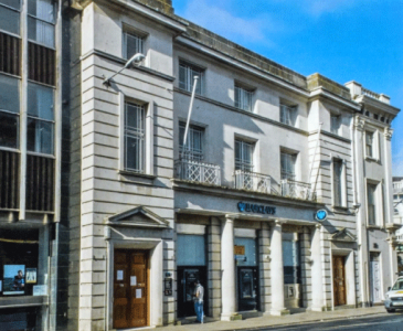 Barclay's Bank, Library Place
 -
 Boots Hilgrove Street frontage
 -
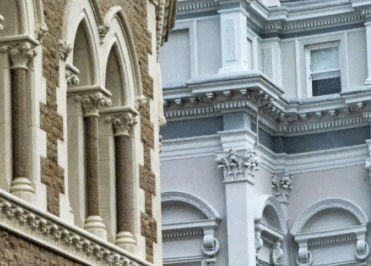 Gothic and Classical in Library Place


